Trust through hierarchy
HIERARCHY · TRUST
Use spacing, typography, and hierarchy to express authority with restraint.
A trust-focused legal website concept balancing service clarity, inquiry flow, and editorial restraint.
Short walkthrough of the hero, service structure, and consultation flow
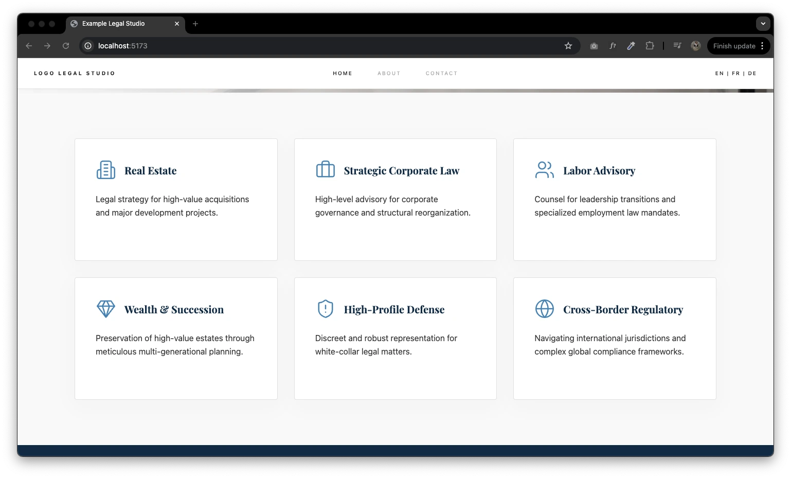
Practice area grid
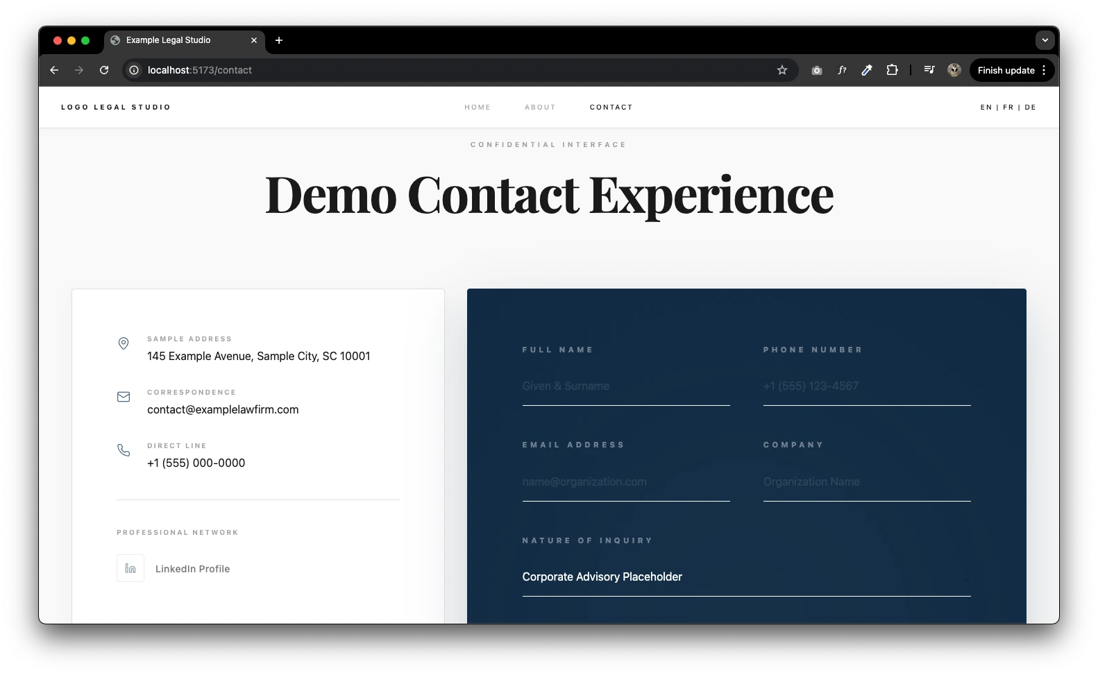
Contact / Inquiry flow
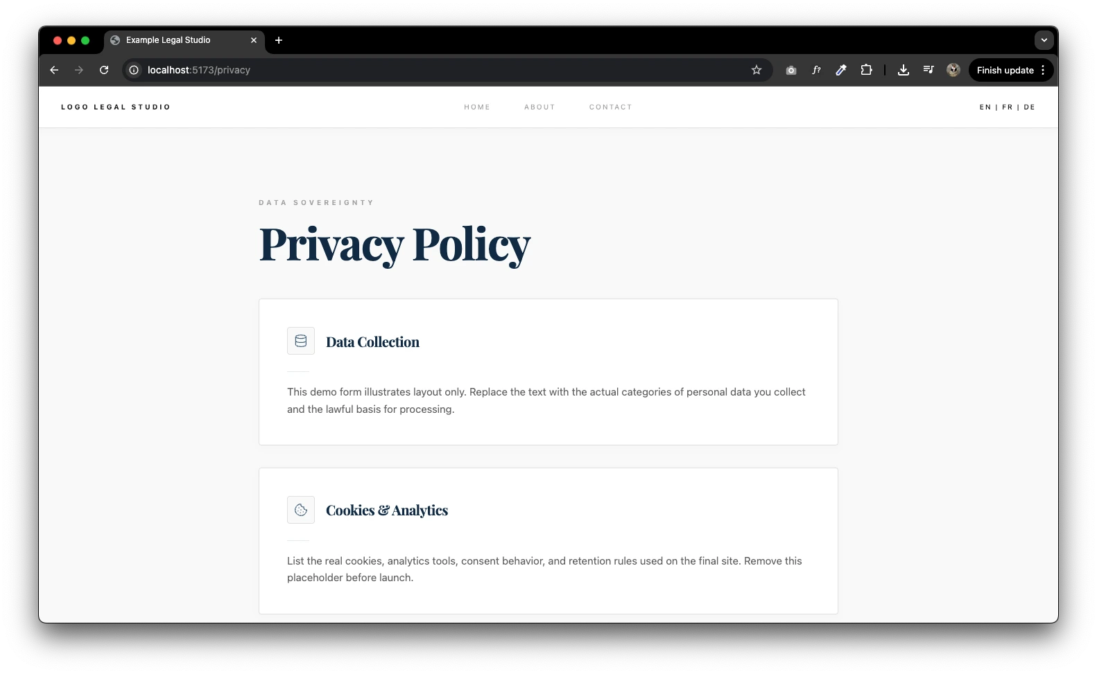
Compliance pages
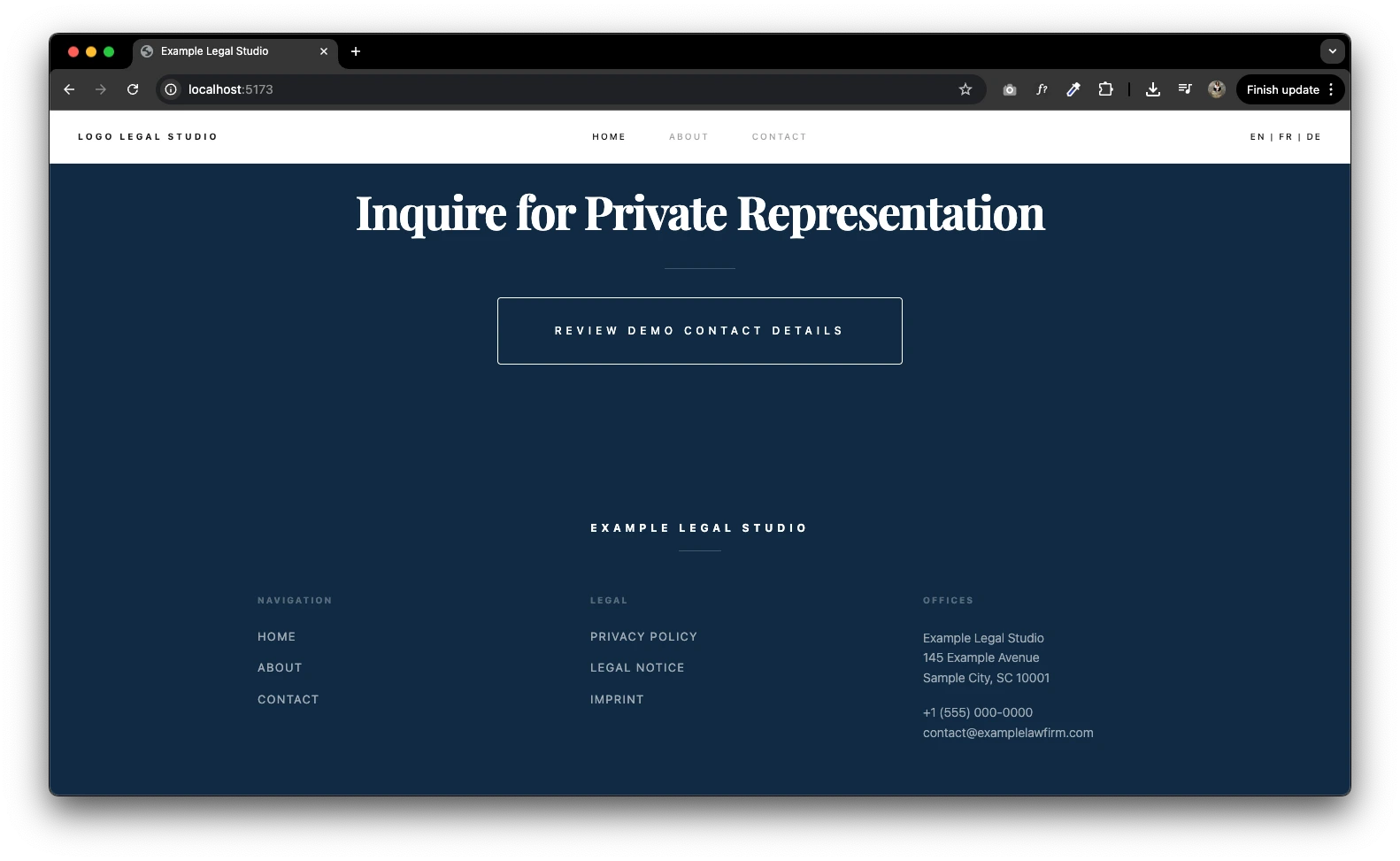
Footer CTA and legal navigation
Legal Services Website Concept is a client project exploring how trust, service clarity, and inquiry flow can shape a credible multi-page legal experience.
Create a credible legal-services website that feels clear and professional without becoming generic, overly corporate, or difficult to navigate.
I independently shaped the product direction, UX/UI, information architecture, visual system, and working frontend prototype.
HIERARCHY · TRUST
Use spacing, typography, and hierarchy to express authority with restraint.
SERVICES · FLOW
Organise practice areas and consultation paths so the offer and next step stay clear.
COMPLIANCE · CLARITY
Keep legal and compliance content visible within the main experience.
Frame the website around trust, service clarity, and visible consultation paths.
Organise practice areas, supporting information, and compliance pages into a clear multi-page hierarchy.
Create the visual direction, responsive layouts, and interaction patterns for the key screens.
Build the frontend prototype and refine the concept as the work progresses.
The concept organises services, inquiry paths, and compliance content into a clear multi-page structure.
Services
Practice areas and supporting content form the main discovery layer.
Inquiry
Consultation paths and contact steps provide a clear route to the next action.
Compliance
Privacy, imprint, and legal notices remain visible within the wider experience.
Authority without convention
The experience needs to feel credible without relying on generic luxury-law patterns or excessive visual formality.
Depth without overload
Legal services and compliance content need enough detail while remaining structured and easy to review.
Clear service structure
Organises practice areas, inquiry paths, and compliance content within one coherent multi-page experience.
Distinct editorial direction
Creates a restrained visual language without relying on generic corporate styling.
Working frontend prototype
Provides a functional basis for reviewing the concept and refining future client decisions.
Define the concept
Design the experience
Build and refine