Product Walkthrough
Short walkthrough of the homepage, about flow, events, and future member layer
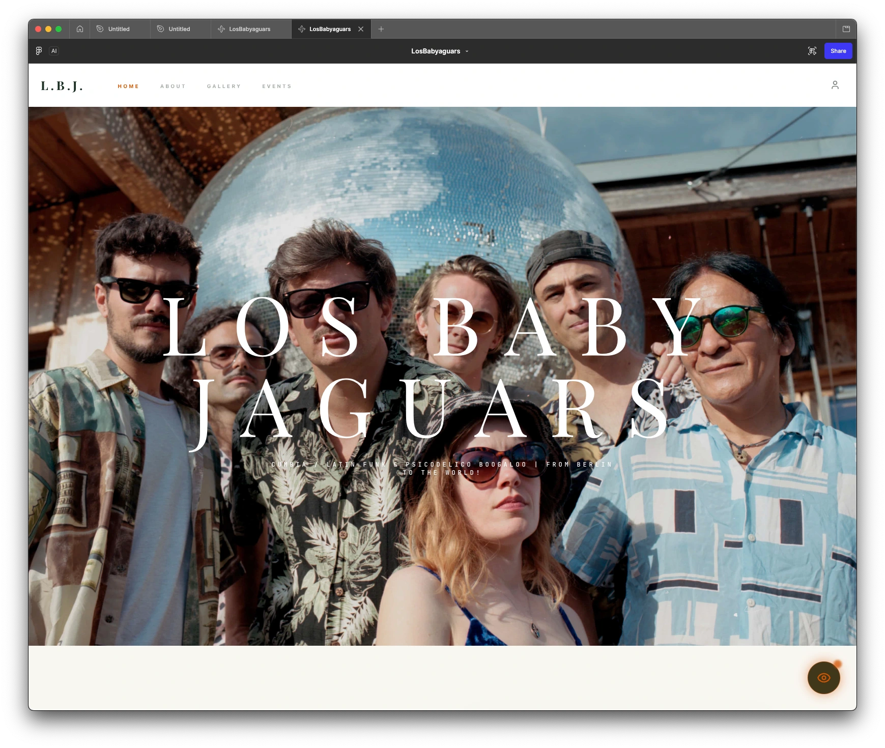
Cinematic homepage hero and identity direction
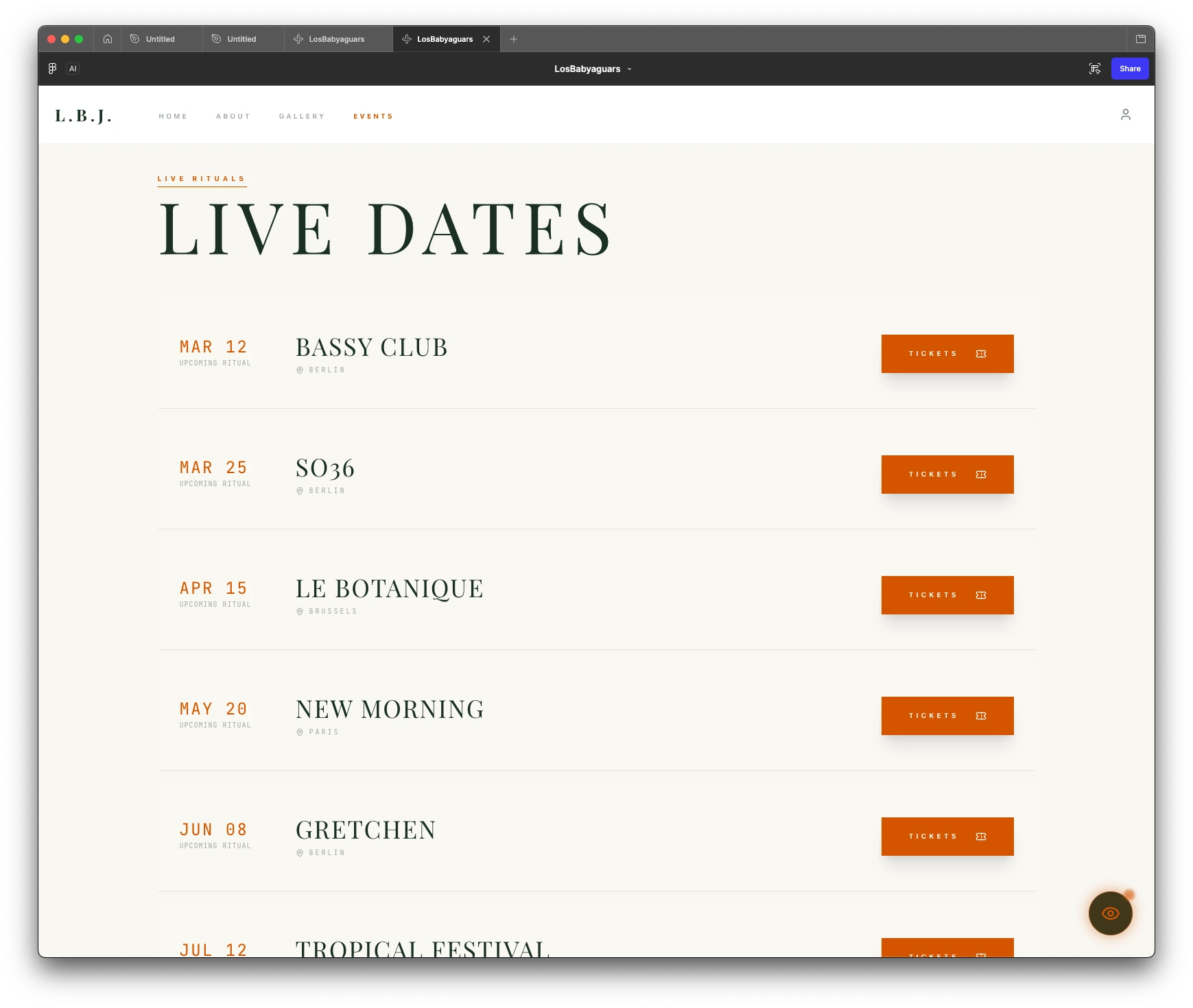
Event-ready structure for live dates and practical navigation
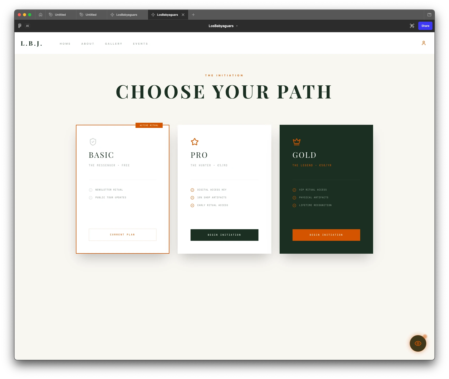
Future member layer explored as a secondary system concept
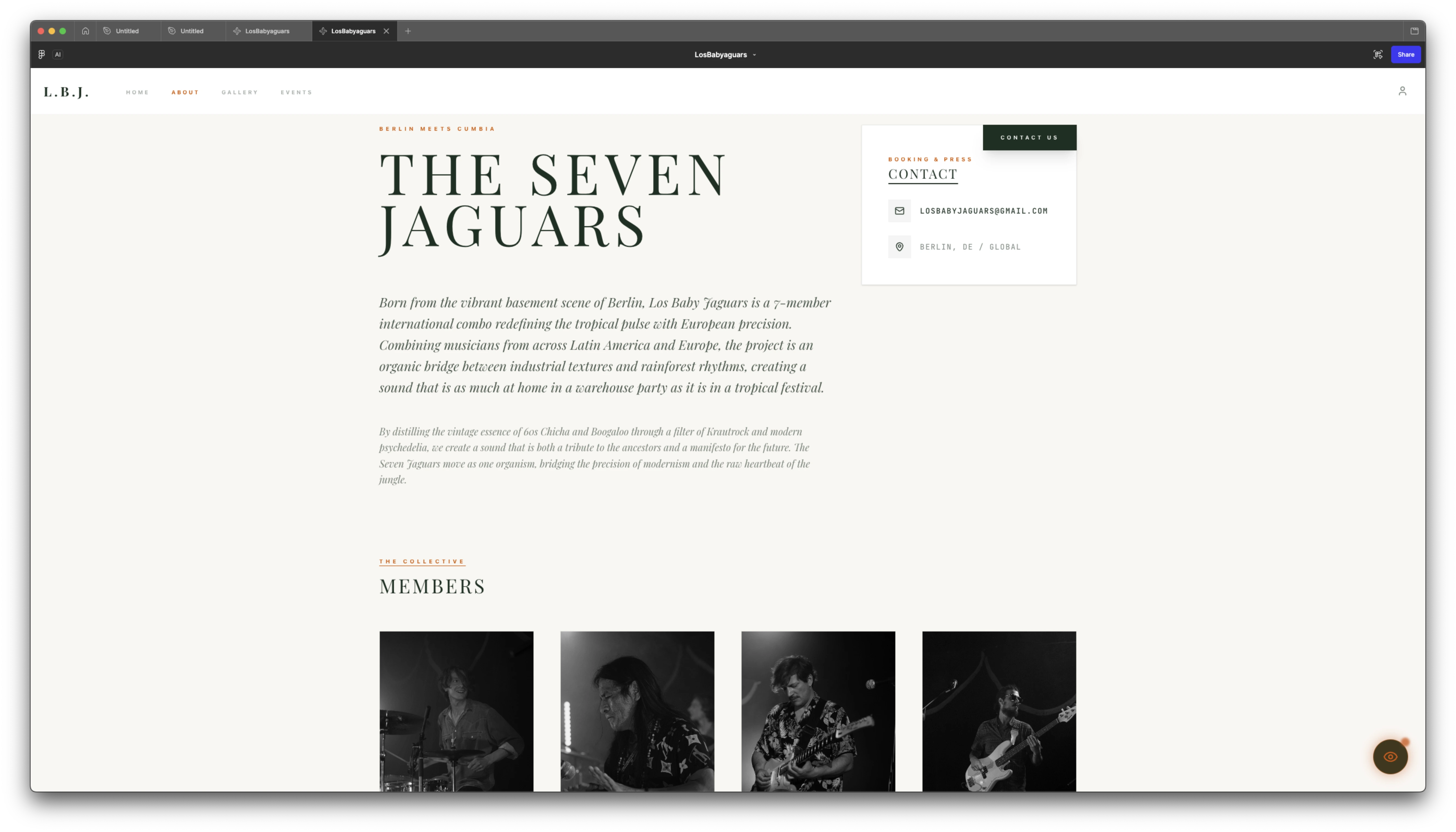
About page combining band identity, editorial layout, and member overview
Overview
Identity-driven interface system structuring visual storytelling, navigation, and scalable content layers. A layered architecture keeps identity, content, and future product features clearly separated.
Problem
The challenge is creating a music website with strong personality without making the experience visually noisy or hard to navigate.
- Generic music website templates often fail to communicate a band's distinct visual identity
- Highly image-led experiences can become hard to navigate if hierarchy is not carefully controlled
- The site needs to balance expressive storytelling with practical content such as gallery, events, and member access
Solution
The experience is structured as a layered system where identity, navigation, and future product features remain clearly separated. Content and events are organized as modular sections, allowing the interface to scale without compromising clarity or usability.
- Structured the experience around clear primary paths (home, about, gallery, events) to maintain navigability
- Treated imagery and typography as a controlled storytelling layer, not as navigation drivers
- Isolated future member and payment flows as secondary system layers to avoid contaminating the core experience
Key Decisions
Separate identity from navigation
The hero establishes visual identity without interfering with navigation or content access
Structure content as system layers
Gallery, events, and editorial sections are organized as scalable modules with consistent behavior
Isolate future product features
Membership and payment flows are separated to protect the core browsing experience
Role
- Defined the UX and visual direction for the band website concept
- Shaped the hero hierarchy around image, title, and minimal navigation
- Explored how storytelling, events, and future member access could coexist without weakening the identity
Process
Identity Framing
I established the tone through photography, composition, and layout direction.
Hero Composition
The first screen became an immersive entry point with oversized type over band imagery.
Content Structure
Navigation stays light, focused on about, gallery, and events.
Prototype Iteration
The current demo is used to review pacing, atmosphere, and clarity.
Future System Layer
Membership and payment logic are treated as future support layers, not the main story of the case study.
Architecture
The system is structured as independent layers for identity, content, navigation, and future product features, enabling scalable updates without affecting core experience
Identity Layer
Defines visual and narrative direction without interfering with navigation structure
Content Map
Home, about, gallery, and events as the primary structure
Visual Language
Full-bleed photography, refined type, warm tones, and cinematic framing
Future System Layer
Member access, CRM touchpoints, and payment tests stay secondary to the brand experience
Prototype Layer
Demo-led review of flow, pacing, and atmosphere
Challenges & Trade-offs
Visual identity vs navigation clarity
A strong visual identity risks interfering with navigation, so primary paths remain direct and structured, prioritizing usability over full visual immersion.
Product extensibility vs core experience focus
Future features like membership and payments are isolated from the core experience, limiting immediate product depth but preserving clarity and avoiding generic interfaces.
Outcomes
Outcomes
- Established a clear separation between identity, navigation, and system layers to improve overall navigability
- Defined a modular content structure intended to support scalable updates across gallery, events, and editorial sections
- Outlined a foundation for future product features such as membership and payments without affecting the core browsing layer
Key Learnings
- Strong visual direction requires strict structural boundaries to remain usable
- Navigation clarity depends on separating layers, not reducing visual richness
- Product features must be scoped early to avoid degrading the core experience
Tech Stack
Stack
Focus